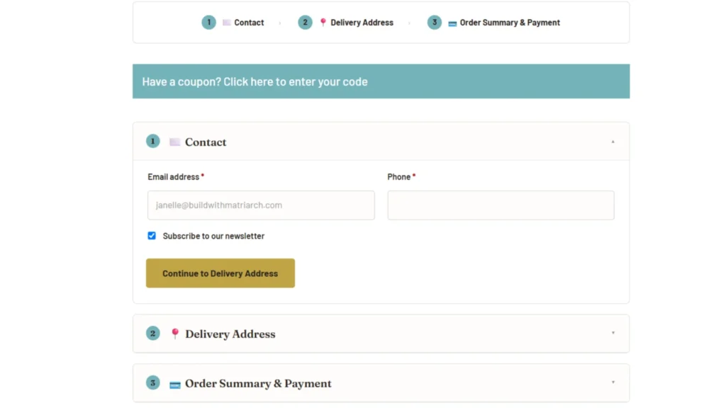
Problem: Standard two-step checkout, no progress tracker, wall of fields, mobile-unfriendly
Tech: WordPress, WooCommerce, Stripe, custom checkout template
The before
The party shop was running the standard WooCommerce cart → checkout flow. Two steps, no logical pathway, no progress tracker. Functional, but not great.
On mobile, it was a wall of fields. No collapsible sections, no conditional logic—everyone saw everything, whether it applied to them or not. Customers had to fill out address fields even for click-and-collect orders. No branding, no sense of progression, no confidence that they were on the right track.
That’s friction. And friction at checkout is where you lose sales.
What I did
Rebuilt the checkout experience from the ground up:
- One page, not two — everything visible, no step transitions to abandon
- Collapsible sections — complete in order, clear progress
- Conditional logic — customers only fill out what applies to them based on what they’re buying and where it’s going
- Click-and-collect shortcut — skip address entry entirely
- Single column, mobile-first layout — optimized for the device most people use
- Branded throughout — matches the business, builds trust
- Stripe integration — smooth payment flow
Zero plugins. Just custom code in the checkout template we were already modifying.
Benefits
- Higher conversion — One-page checkouts typically reduce abandonment by removing step transitions where people drop off
- Faster completion — Conditional logic means customers fill out fewer fields, faster
- Better mobile experience — Single column layout = easier to complete on phones
- Reduced friction — Clear progress, collapsible sections, branded experience = more confidence to complete purchase
- Fewer errors — Customers only see relevant fields, less confusion = fewer mistakes at checkout
The checkout went from a generic, plugin-stacked, two-step wall of fields to a clean, conditional, one-page experience that guides customers through.