Three mockups. One website. How we find your design.
Describing the website you want can be surprisingly difficult. You might know the feeling you’re after, have a few colours in mind and recognise something you love when you see it. That doesn’t necessarily mean you can explain how the whole thing should look.
That’s where the mockups come in.
I usually put together three design directions so we have something concrete to talk about. We can look at the layout, colours, typography and overall feel together, then work out what belongs on your website.
For Bounce Haus Co, that meant three interpretations of the same brand: black, white and gold, with plenty of personality.
Something you can actually explore
I build my mockups in HTML, so you can open them in your browser and scroll through them. Where I’ve included hover effects or animations, you can see those working too.
Movement can make quite a difference to how a design feels. A screenshot gives you a useful overview, but being able to explore the page helps you get a better sense of the direction.
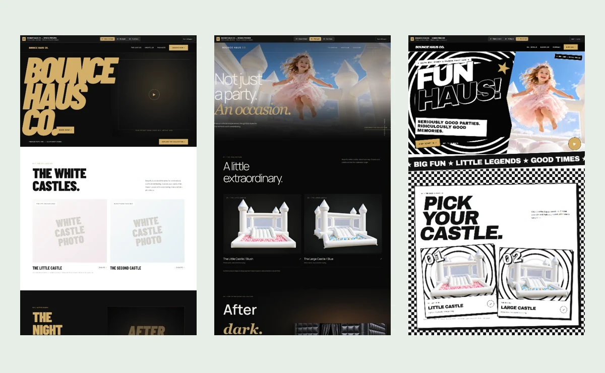
The screenshots below show the three options I presented to Bounce Haus Co.
The first two: different interpretations of your brief
For the first two options, I tend to stay fairly close to the client’s brief while exploring different ways to bring it to life.
Bounce Haus had already given me their colour scheme and a good idea of the vibe they wanted. That gave me a strong starting point, with room to explore how bold, polished or playful the website could feel.
Option one: Black & Gold
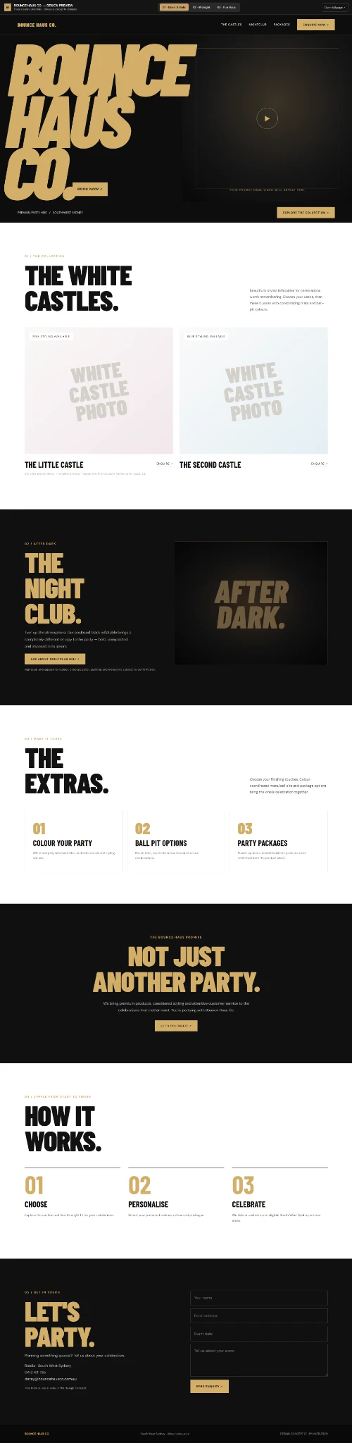
The first direction used oversized gold lettering, strong black-and-white sections and bold typography. It had a confident, energetic feel, with plenty of space for the hire collection and party packages.
This was the direction Bounce Haus chose.
Option two: Midnight
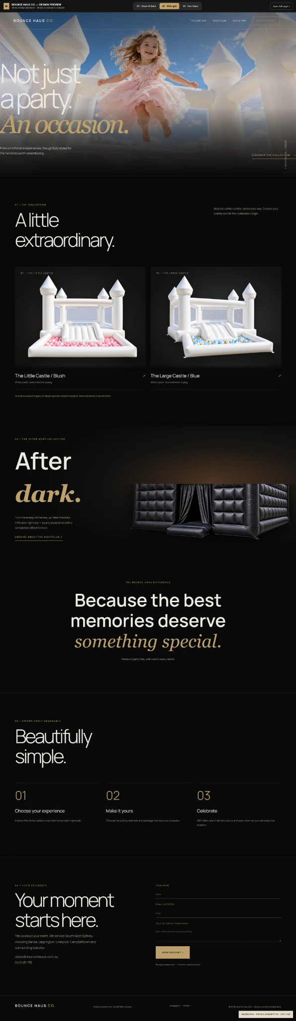
The second direction used the same palette with a softer, more elegant treatment. A large photograph led the page, with finer typography and more restrained gold accents.
The colours hadn’t changed, but the atmosphere had. Seeing those two options together made it easier to compare what different design choices could do for the same business.
The third: a little room to play
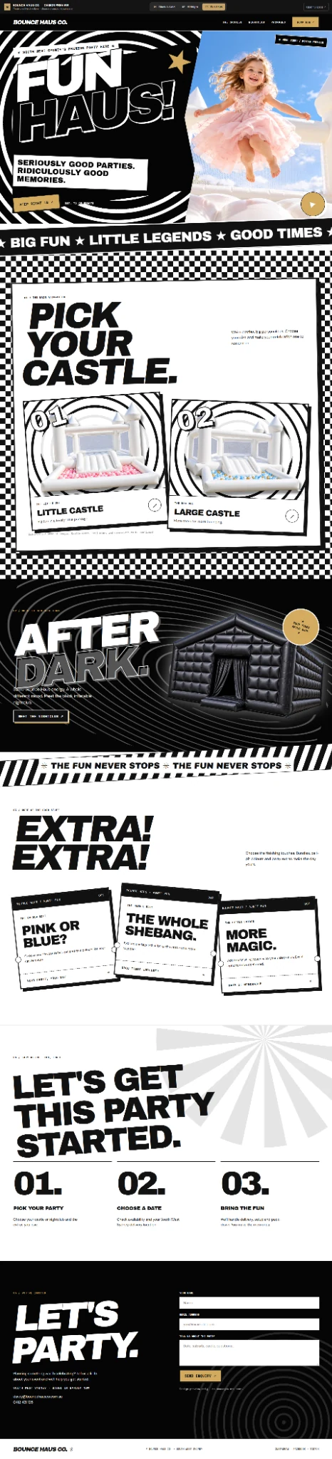
For the third option, I usually try something a bit different.
It still needs to make sense for the business, but this is an opportunity to show a broader range of possibilities. Sometimes that unexpected direction turns out to be exactly what someone wanted but couldn’t quite describe.
For Bounce Haus, that was Fun Haus: checkerboard patterns, oversized lettering, stars, tilted cards and a much more playful graphic style.
It kept the black, white and gold while turning up the party.
You can like bits of all three
I encourage clients to tell me what they like and dislike across the whole set.
You might love the opening section from one option, the product layout from another and the typography from the third. You might like a particular colour treatment but find the page too busy. All of that is useful feedback.
You don’t need design terminology to explain it. “This feels too formal” or “I love this bit, but that heading is a lot” gives us something we can work with.
And sometimes the decision is much quicker.
Bounce Haus came back with a clear choice: number one, with a few small changes, including adding a gradient to the big gold lettering. The mockups had given them enough to recognise the direction they wanted, and we could move into refining it.
What helps me make a strong set of mockups?
A few links to websites you love—or hate—are incredibly useful, especially when you tell me why.
Perhaps you love the way a site presents its products, but dislike its colours. Maybe a website looks beautiful until you try to find anything. Those details help me understand your preferences much better than a link on its own.
A clear idea of your brand and audience helps too. Who are we trying to reach? What should the business feel like to them? What personality should come through?
You don’t need to arrive with every design decision made. Bring your ideas, your examples and whatever you already know about your business. I’ll use those to create a few directions we can explore together.
That’s what the mockup process is for: making the possibilities visible, so choosing your website’s direction feels a whole lot easier.
See how the chosen design became a complete hire and booking website in the Bounce Haus Co case study.
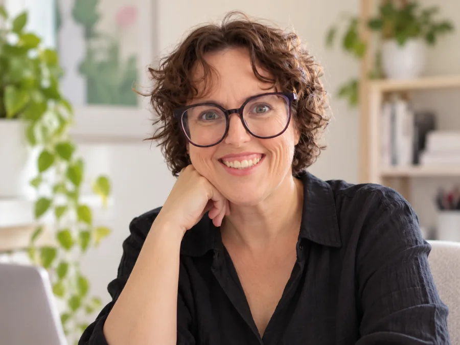
I’m Janelle, a web developer based in Frankston, building custom websites and booking systems for businesses across Australia.